Written by
Clark Narvas
What were you doing four years ago?
Pauline lived in rainy Leeds, UK and worked for a big enterprise company, crawling but thriving in the rat race. I was a 15-year-old GCSE student modding Android phones. Now, I’m entering my second year of university, and Pauline is dead-set on building tech communities and probably taking over another corporate YouTube channel.
It's all change. And we felt like the PAWLEAN brand needed a change too.
Pauline is doing a lot nowadays (when is she not?) She’s doing more than making travel videos or giving speeches at Women in Tech (WiT) gatherings. A changed brand design is a tool in her swiss-army knife that helps her communicate everything she is doing both professionally and personally.
“The brand doesn’t feel like me anymore.” Pauline texted me from a cafe in sunny Athens, Greece. “It needs to reflect who I am now.”
The original PAWLEAN identity
It was all organic, there was no plan.
The font, ‘DIN Condensed’, was picked by Pauline while making the thumbnail for her “Visiting the Big Apple ‘17” video.
The PAWLEAN purple was chosen because someone with synesthesia told her once that she radiated a specific purple. A hex code was born.
The iconic PAWLEAN symbol was created by another, made from putting together vectors of emoji paws and muscles (lean).
In 2020, it was the first time we officially put everything on one brand sheet. ‘PAWLEAN’ was presented in a slanted text alongside the symbol with swirls in the background.
The slanted text was inspired by grassroots political movements — fitting as Pauline had built movements at universities, in the tech world and even on Discord servers!
It still looked great after a couple of years, but Pauline changed, and so did the way she used the brand.
Starting off…
The ‘Pauline Narvas’ and ‘PAWLEAN’ identities need to work in two different contexts: one to showcase her professional work, and another when she’s writing about her curls (and anything else that leaks out of her brain!) They should both look and feel like Pauline.
How we worked together was initially very async with countless messages back-and-forth about how the logo could be re-designed.
”I don’t like how the symbol looks cartoon-y.” Pauline continues to type in yet another Athenian cafe while sipping a freddo espresso. “Also, it looks too political. Don’t you think so?” I sheepishly grinned as I thought about my previous political design inspiration.
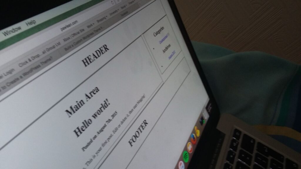
During the recent bank holiday, whilst she was refining her self-described “spaghetti code” on her new headless WordPress app, she asked what I thought about the design she had created. Yellow on purple text in a playful handwritten font.
I took out my laptop, and said, “why don’t I give it a bit more of a rebrand?”
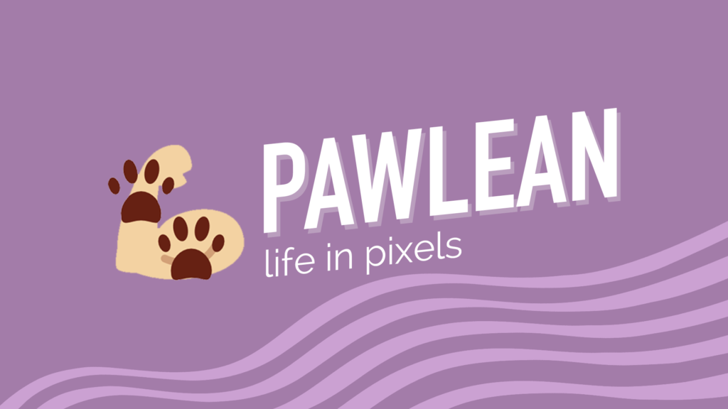
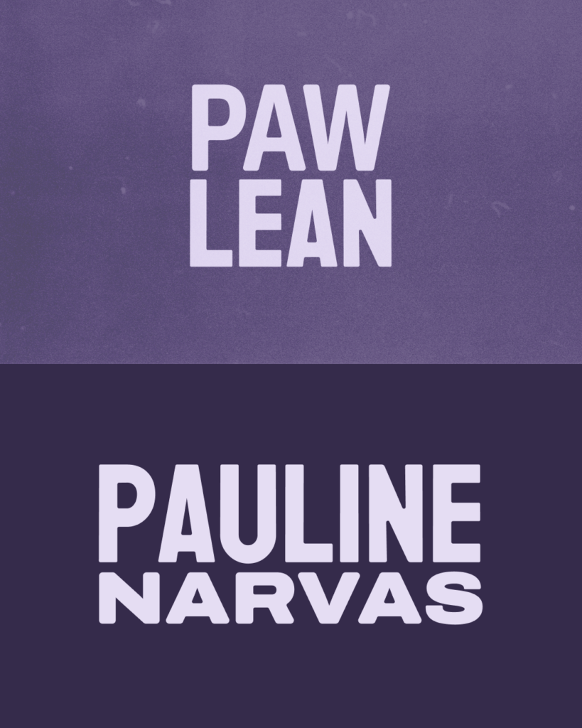
The new PAWLEAN identities
In the span of a 7-hour hackathon, we built two linked identity sheets for both ‘Pauline Narvas’ and ‘PAWLEAN’.
The aim was to create an outgoing, strong brand that was a more honest reflection of who Pauline is, now in her late twenties. Although the two identities were joined together by a common style, I adapted the assets depending on the medium.
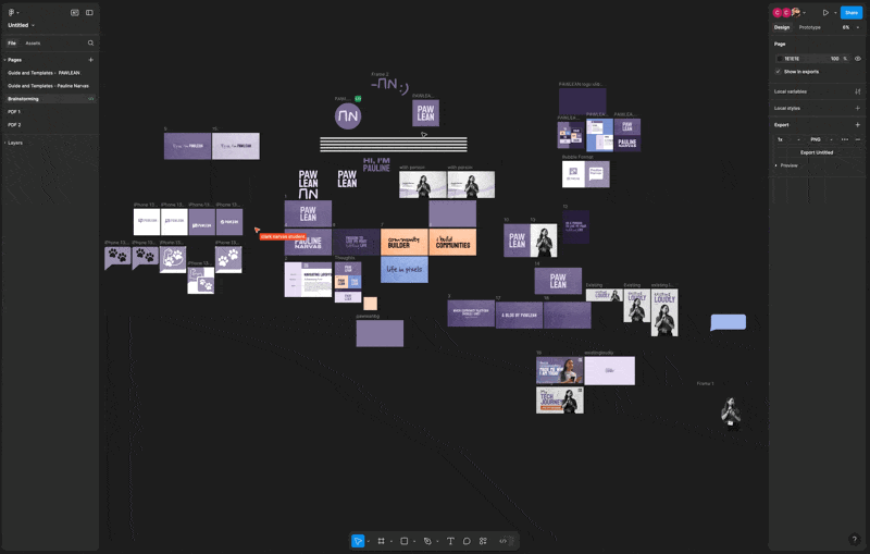
Figma serves as our repository, with logo assets, backgrounds and guidelines ready to view and export. We chose this instead of traditional design tools because its collaboration tools make it like Google Docs for digital design, and its simplicity allows for a very quick design turn-around.
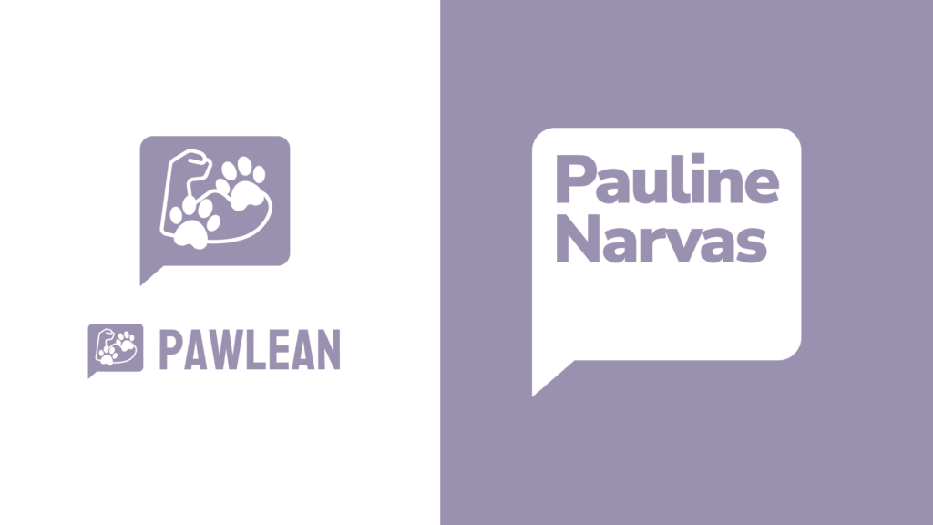
The symbol
We ditched the paws and muscle symbol, opting in for a timeless, text-based PAWLEAN logo and a ‘Pauline Narvas’ wordmark that seamlessly worked well together.
At the end of each content, we’ve introduced `ΠΝ` (Greek letters for `PN`) signature to capture her appreciation for Greece as well as some authenticity – it was as if she signed off on everything published.
Purple, Orange Juice, Aegean and Midnight
PAWLEAN purple is iconic, but having one colour narrows down the creative possibilities when branding side projects, and tonal flexibility.
We created a more diverse colour palette consisting of a darker ‘PAWLEAN purple’, ‘orange juice’ orange, ‘Aegean’ blue and ‘midnight’ purple. All of which corresponds to things she likes: purple, orange juice, the Aegean sea and Taylor Swift’s Midnights album.
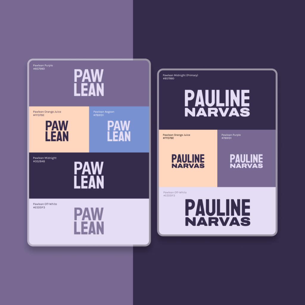
The use of colour is different depending on where it’s used. In PAWLEAN, the primary colour continues to be purple with textures for extra personality and depth.
In Pauline Narvas, the primary colour is midnight to convey more serious business.
Decorating words
We have multiple brand fonts:
- a handwriting font called ‘Mynerve’
- a sans-serif body font called ‘Karla’
- a heading font called ‘Koulen’
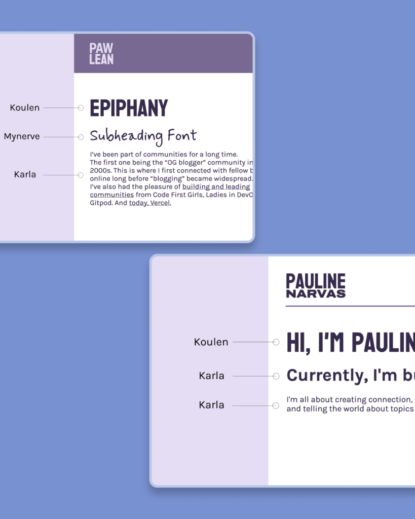
We’ve never really explored having a handwriting-style font, so this was fun!
We also wanted to capture as much of “real life” Pauline as possible, who actually writes in a cursive style that is impossible to read most of the time.
I chose the font ‘Koulen’ as it reminded me of a stronger, better, faster version of the former ‘DIN Condensed’.
Bringing it all together
In just 7 hours, we built two versatile identities that can easily be applied to any medium.
This project has felt like deja-vu as I’ve seen Pauline reinvent herself, along with the brand for the last 9 years. It’s great to give it a radical fresh coat of paint that it really needed.
If you liked this post, check out my portfolio for more of my designs, connect with me on LinkedIn, and if you’ve got something coming up you’d like to collaborate on, let’s get in touch.
Hey! It’s Pauline, breaking you away from this incredible post written by my brother for a short message.
_For those curious, I re-built my blog using the ‘Headless’ WordPress i.e. using the WP API, Next.js for the front end deployed onto Vercel. I’ve done this set up before for both of my digital homes[1][2], so it was nice to revisit this stack as part of my personal onboarding to my new job 🤭
_
I’m planning to write a post about this more, but in the meantime, you can check out Vercel’s Headless WordPress template and guide if you want to dig deeper.
Thanks for reading!